
City as Lab
Using digital technology to visualise and tackle real-world challenges in Nottingham city
Interview with Gary Priestnall and Paul Grainge, written by Andy Barrett
The University of Nottingham’s City as Lab, which uses digital technology to harness and visualise place-based data, is based at the new Castle Meadow Campus not far from The Meadows. Having been in existence for around a year the Lab is an exciting and collaborative project that seeks to use its award-winning tools to understand the issues and challenges facing the city, and to explore responses to these with the people, places, and policymakers of the Nottingham region. Central to the Lab is the PARM – the Projection Augmented Relief Model – a three-dimensional model of the city that allows the exploration of all kinds of scenarios through map-based data projection.
I went to see the PARM and to talk to Gary Priestnall, who specialises in geographic representation and visualisation, about how and why the model was created and its possible uses. We were then joined by Paul Grainge, the academic lead for the Lab, to talk more about the wider City as Lab project and the ways in which The Meadows community could become involved.

The Projection Augmented Relief Model
This is a really impressive looking thing. What was the impulse behind its creation?
I’ve been working on this general technique for around 15 years. My original motivation was for storytelling in museums, which has used simpler forms of this idea for some years now; and then working in schools relating to flood risk in Keswick and undertaking flood modelling for the Environment Agency. For the last ten years I’ve been working with Nottingham City Council, creating smaller models to explore and demonstrate their potential.
When funding became available from central government to explore 3D through the Prop Tech scheme, which was exploring how to use digital tools to help communities engage with the planning system, we were able to quickly scale up the idea and work from a really detailed digital city model that the Council had.
The model is put together from a series of 3D printed tiles that are 20cm square and which take around a day each to be printed. There are 151 tiles in all and it took about three months to pull the PARM model together, with the initial purpose being to engage people in the planning process. But there are so many other purposes we can put this to; we can throw any kind of data onto it to generate all kinds of conversations.

A printed tile of the city centre
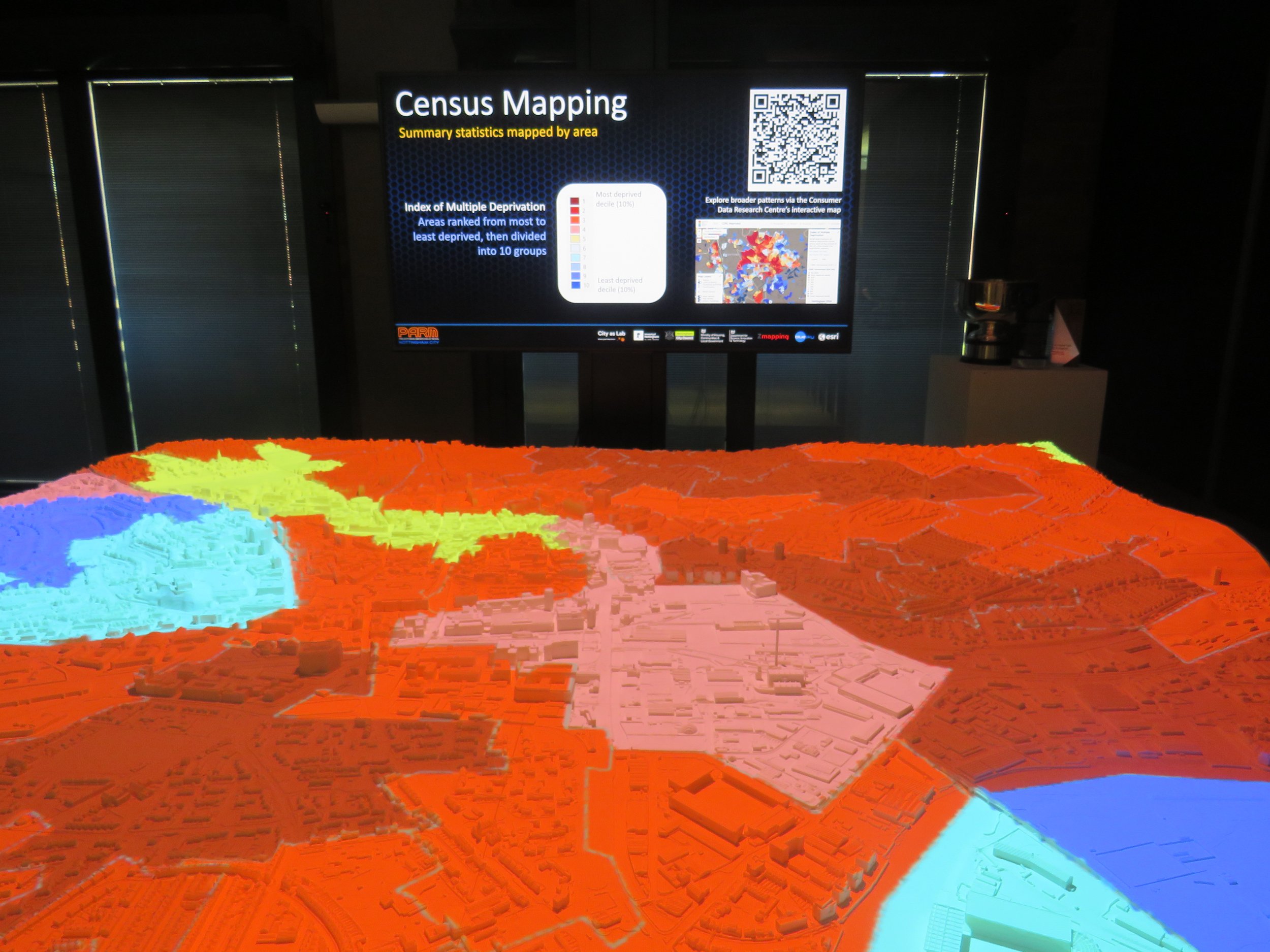
Most people find it much easier to interpret a physical model than they do a map. It’s much more immediate, it’s there in front of them, whereas there’s a bit of work to do to interpret a map and because of that you find that people can end up interpreting them in different ways. This is a more natural way of looking at a landscape. It’s been recognised for a long time that there’s something powerful about physical 3D models.
For example, if you look at a projection which maps census data around deprivation levels, which is the kind of thing you might easily find in a map on the web, the physical model is a powerful way of bringing this information to life. You see how it affects actual streets; you see where the terraced streets are, where the industrial units are.
Is there something about the scale of it? A sense of standing above the city, almost God-like?
Yes; and that term is recognised in the history of relief models, even before digital mapping; going back two hundred years: the idea of the privileged perspective of landscape, as if from a cloud. It looks impressive as it is; but it’s once you overlay an aerial photograph onto the model people get a sense of the green spaces and the river, and it really comes to life.
Is that a boat on the river? Is that cloud shadow moving across it?
Yes; these kinds of models and displays are often used in museums and visitor centres and cloud shadow is a way to ensure that if people catch it from a distance, they realise that it’s not just painted; that there is more chance of them coming over to look at it.
When you see the city laid out in front of you like this it doesn’t look as though there is a great deal of green space.
If you go wider than the unitary authority you start to see a lot more green space: Wollaton Park and the Forest Recreation Ground. But the city centre itself is quite a close collection of streets and buildings; and you really see that with this model. Not all of The Meadows is on it, but you can see the top two thirds, where most of the housing is.

What was the first thing you mapped onto it?
The very first thing was the aerial photograph. We needed to check the alignment, to make sure the aerial photography was sitting in the right place, that it was aligned exactly with the model, not just the river and green spaces but streets and buildings as well. Technically that was a challenge, but when it worked and the two things came together it was definitely a ‘wow’ moment. Once that was in place we were quickly able to get lots of other data that was good to go to create projections we could overlay onto it, because of all the work we’d already been doing.

The unlit model

The model coming alive with projection
We can map a lighting effect onto the model, or we can add data from historical maps. If you transcribe data from old maps and then render the image it takes less than an hour to create the projection, so it’s a pretty rapid process. There’s also a great deal of geo-referenced digital data available from the Geographic Information System that we can lay straight onto the model and combine it in different ways to tell stories about different aspects of the landscape. So, if you wanted to tell people about the fact that the Victoria Centre used to be a railway station we can do this, which lights up the Victoria Centre and the yellow line shows the route of where the railway used to be.

We have school sessions in here, one of which was telling the group about the history of the River Trent. It used to be a lot more powerful in the past; it meandered round a lot more and carved out river cliffs that the castle is sat on. We don’t have the detailed data to show this in a sophisticated way, because it has changed course over thousands of years, but a lot of people don’t realise that the Trent has moved around; they don’t realise it has carved these river cliffs. This model can show you the flood plain and how large it is, how much of the city is built on it; leading up to the cliffs on which the castle is sitting. Another session was showing the development of the city and how it has expanded over time. There’s so much we can illustrate and bring to life.

An expanding city and a changing river course
You really get a sense of the city as a dynamic thing; that things are always changing, and that maybe you have the potential to engage with that process of change in some way.
This tool is proving really powerful not just to storytelling but in getting people to talk about a place. It promotes discussion about the city, or places within it, and that’s really what this is about; what it’s for. I asked a large group of my students where they thought the heart of the city centre was, and when you put that information on the model and you see it a story begins to emerge about how Nottingham is perceived and understood. But I could have asked them where they think the safer areas of Nottingham are; or where they think the areas that could do with renovation are. It’s a way of visualising multiple responses, because everyone’s got a slightly different idea of the geography of the city in their head. There are so many possibilities and we’re really only scratching the surface. We want more dynamic data, and data about people’s visions of the future; to use this as a way to carry out visioning exercises. What would you like to see here? And then to layer that information onto the landscape.
I presume you can get quite granular with this – that you can light up particular streets and maybe even houses?
Yes; as long as we have the data spatially referenced, and that can be done in different ways. It could be an address or it could be a GPS location from a mobile phone. We’re working to make it possible to map data from lots of different starting points; and then we can colour code this data and layer it on top of each other. If you had the information you could light up all the buildings that were shops, or places where people have said there’s a problem with waste collection. For example, we realised there was a gap in our data around mobile phone signal strength in the city so we had a team go out to record the signal strength of the four major providers. Once that information was projected onto the model you could clearly see the areas in the city that aren’t as well served as others.

If you’re on the map, and you know your postcode, you can be lit up too.
Presumably phones are a good way to do this? If you had a cohort of people across the city willing to answer questions or gather data then you could run an interesting citizen science mapping project.
In terms of citizen science there are great possibilities. It could be bird sightings or perception of flood risk; we’ve really only scratched the surface so far and are looking for opportunities to do more. In the City as Lab space we’ve had over 2000 people come through here in the last year in various sorts of groupings with all sorts of different interests; some with an intense interest in geography and some not, but this model always gets people talking.
What kinds of information do you have around climate issues?
We have some; such as satellite information showing ground surface temperature.

If you look at The Meadows you can see that the hottest area is in the terraced streets, with this almost fortress-like shape, where the wind is not going to dissipate the heat. It’s dense in terms of the building materials, the concrete, and there’s not as much vegetation. Whereas in the areas outside of this, where there is a more open design, there is less heat. If I switch to another map that shows healthy vegetation you can see how the two correlate; and that there is a clear cooling effect.

You could overlay and combine those two sets of information to create a new map. That’s what a Geographic Information System does well; allowing you to overlay layers and quantify spatial relationships. Or you can just look at the two sets of information and talk about it; there are various ways of telling a story. You could also overlay different census variables, such as those related to health and vulnerability to heat. The model could then let you see whether the populations in hotter areas are the very people that are more vulnerable to that risk.
I’ve created quite a few displays related to flood risk in the past and we have one which shows what would happen if the flood defences of the Trent were breached, which is calibrated from data that is publicly available as a flood risk map for planners. You can see that different parts of the Meadows would need different planning regulations because of the flood risk.


The idea of being able to see water moving across a city, and how close it might come to where you live is a very powerful tool. It would be interesting to map those places where, for instance, grants for insulation are more common and then see if it is in those places where it is most required. I presume it’s all about getting the data?
Yes; some of the data might be at property level, some might be at a general postcode level. There are all sorts of levels of granularity, depending on where the data comes from. But if it’s got a spatial reference of any kind we can put it on the model and start to combine it in all sorts of ways.
But presumably you need a certain quantity of information for it to have real value?
That’s right; it’s important to be transparent about what is being represented, and sometimes you just can’t tell a story properly because the data isn’t available. Air pollution is one where the data recordings are relatively sparce. If we produced a projection map that was based on just two sample points, and we could do that, it would give a very unrepresentative picture. There isn’t enough density of sampling, and health-related data with more granular detail is something that we need more of. So, we need to be careful how we explain what we are showing; because this is such a powerful and immediate way of presenting information and data.
How might AI impact the way the model is used?
AI could be useful in identifying appropriate data sets to explore a problem. If data is machine readable, if it has descriptive metadata, that will allow AI to gather it. But as well as being geographically referenced it needs to know when and what the data was captured for, so it can assess whether it’s fit for purpose for a particular problem-solving exercise.
You also have smaller models of different parts of the city that are portable?
Yes; they typically have 16 tiles in a 4x4 grid. We have a model of Bulwell that is being used in schools, and we’re using that to show different official mappings of where the students live but also to get them to think about what their vision of Bulwell is: where are the places they are interested in? We asked students to go out and record voice notes about locations that were important to them, and we can play these whilst the location they are talking about is illuminated. It’s very simple to do but again it links ideas and perceptions about place really effectively. I’ve created a display in Yorkshire that’s based on oral histories; people talking about their childhood memories of agriculture and fishing, of land use change, of the mills closing. As the audio is playing the locations being spoken about are illuminated.

A portable PARM of Bulwell
So, there are two very different ways of using this technology. At its simplest it’s a tool of relaying information, that can be really effective in museum settings; but with the PARM it’s more about developing conversation and ultimately policy. I can imagine when there are a lot of people in here standing around the model that it feels a little like being in a War Room; of people saying ‘what happens if we move this here?’
That’s how we see it. It gives people space to question and say ‘can you show me that again?’ One of the things we’re looking at is creating a version of the projection software that allows us to be a bit more agile about how we can layer things and respond to questions by bringing in other data sets. At the moment we have a fixed set of displays and projections.
Have other cities and councils been to see the model?
They have, because there aren’t any other models quite like this out there at the moment. It won the British Cartographic Society Map of the Year in 2024 and that peer recognition is helpful. Through the Prop Tech scheme we’ve worked with Bradford Council and Bradford University to share our knowledge and they’ve developed one. This year we have follow on funding to create a do-it-yourself guide for other local authorities. We want to spread this knowledge around because these displays have so many possible uses. We’re also working on creating ultra-portable models which can come apart in four sections, so that we can carry one around in a small flight case and pop it up on a table in five minutes.
After looking at the model we were joined by Paul Grainge, the academic lead for the Lab.
Can you tell me more about the way the City as Lab, and particularly the PARM, is engaging with policy discussions and decisions within the city.
What the PARM does is to bring together people who are trying to do different things for the city but are bumping against competing agendas. For example, the police want to make parks safer for young children and to do that they need to cut down tree canopies to make sure CCTV sightlines are clearer; but there are areas where there is a real need not to cut down trees because of the carbon importance. We can see those different sets of information on the model and how the data intersects. The PARM is not solving any problems, but it’s becoming a meeting point for collaborative discussion around how we address and bring together different people to address these challenges and make a difference.

A projection exploring public transport links
So, the more data you can get the more sophisticated those discussions can become?
Yes. And different organisations immediately see different uses for the model. The police might want to link data on anti-social behaviour with data on knife crime and indices of multiple deprivation. What is the story that is being told by bringing different bits of data together? And how can that link with other issues, like health outcomes?
The space that the map is in is also important, and we want to develop this space as well as the PARM. This initiative is led by the University of Nottingham but not by any one faculty; it’s a cross-university initiative to make place-based collaboration easier, more long term, and we think it’s important that we’re having these discussions close to the city rather than two miles away. We were the first to arrive here and both the Lab and the campus will start to evolve. We want to investigate how you create a space and an environment that is genuinely trying to understand what co-creation is. How do you involve communities in setting research questions that then sponsor and generate collaborations?

We had the Police and Crime Commissioner here this morning, with members of the Bulwell community of different ages, and were able to develop what might be a more inclusive set of conversations by using the tools that we have. This isn’t an elitist technology; it’s not complicated, and so the young people that were here can use it alongside the Police Commissioner. You don’t have to put a helmet on, it’s just in front of you, it’s a very natural thing. Whatever discipline you come from, whatever organisational background, everyone can find something to talk about. There’s something of the camp fire idea about the PARM, of gathering round to share stories. Teachers are observing that some of the kids that wouldn’t normally get involved or engage very well are finding their voice. The attention is on the model and not on them.
When you invite different people into the conversation you have the chance to discover new forms of knowledge as a result of different questions being asked.
We’re seeing that in our pilot with Bulwell and the portable PARM in the conversations and questions that we’re starting to lift out. They’re not the things you usually find on open data sets, because they’re coming from lived experience of being in that community. We’re only a year into our work here and are at the beginnings of exploring different approaches to how you collaborate and develop insights from place-based data. The PARM models are one way of doing that but we’re interested in other ways of working.
I’m a community artist who has explored ideas of place for 25 years; the work of many community arts organisations is driven by finding ways to represent, celebrate, and interrogate ideas of place.
We had a piece of data around air pollution that was important but the way it was presented was impenetrable. So, we worked with City Arts to produce two art works based on that data which are currently being displayed in their window gallery. We’ve engaged in a number of art collaborations and are hoping that through various ways of approaching data and making it legible that we can start to change the dial in terms of who is becoming interested in that data. Because then more people engage in discussion, and the policy applications can begin to build and grow.
One of the art-based collaborations was the Photographing The Meadows project in which six new photographers were equipped with technical skills and historical knowledge to make a photographic-document of The Meadows area based on their own interests and observations. This work is exhibited at the Lab and you can see some of the pictures, and read the photographers thoughts on the project here.
A day in the life of this space is interesting because you’ll have a load of young kids talking about mental health through graphic novels, and then in the evening you’ll have NHS staff thinking through the provision of support for mental health. We’re facilitating events and conversations but always with an aim to link these with people who are trying to deliver services in the city.

How might people in The Meadows get involved with the City as Lab?
We’ve already been engaging with The Meadows and it’s something we’re keen to develop. The Friends of Meadows Library and Meadows Library have come in a number of times and we’re in discussion about bringing a group of younger children here. We’ve also had visits from the Green Meadows Project and with local schools. If you’re a member of a community group and you’ve got an idea that you want to explore then you can contact us and we’ll see if it’s something we can set up. (You can find more about that here).
The idea is that we will print a Meadows PARM in the next few months with the ambition that from September onwards we can really start engaging in a serious way in and with the community. Together we want to explore all kinds of data from The Meadows and investigate what stories should be told through that data. What are the techniques for communities to act as both citizens and researchers to become collectors and curators of their own data? There are a series of apps – Zooniverse is one – which people can use to help with this.
People often don’t realise that they have spatial data. They don’t realise that a spreadsheet with a postcode is easily mappable. Anything with a GPS coordinate works but it can be easier still. This morning, we captured young people’s visions of safe cities in Bulwell and Clifton on paper which we can easily transcribe into digital data. There are all sorts of different starting points; the main thing to consider is what do you want to show, what have you got and what can we help you with?
It could be anything. How many hours of TV do you watch? How much Chinese food do you eat?
There’s a balance between not setting too many agendas in advance so that communities can define the kinds of data they want to investigate, but also not being so wildly amorphous that you can’t find any kind of focus and which doesn’t provide you with anything that policy makers might feel able to act on in some way.
How often do you engage on that policy level?
This is a really interesting direction of travel for us. The East Midlands Combined Counties Authority has a new Mayor and their team has been in a lot; and we have a really close relationship with the Nottingham City Council. Every Thursday we use this space and tools to co-host and facilitate a Nottingham Urban Room which the Council use, but it’s available to other groups as well. The Department of Transport has been here trying to think through how to use Nottingham as a test case for active travel; UNESCO City of Literature has used it to have a ten-year stakeholder discussion. We’re very open to ideas. This whole project is fundamentally about co-creation.

You can find out more about the Urban Room, including previous themes that have been explored, here.